11 Hidden Symbols That Can Be Found in Famous Logos
World-famous brand logos follow us wherever we go. We see them in television commercials, on our way to work, and on T-shirts. And, in 90% of cases, we’ve no idea what meaning is hidden in those seemingly abstract lines.
McDonald’s
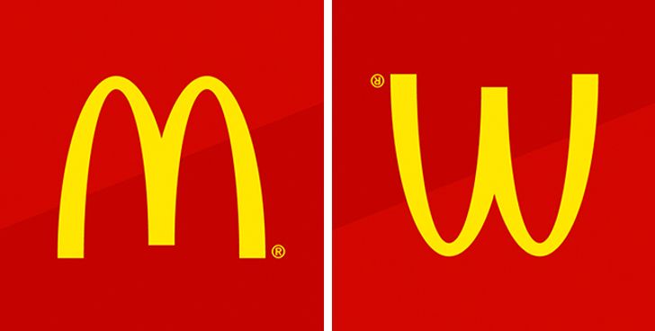
The designer of the first McDonald’s restaurants came up with the idea to equip the buildings with two large golden arches. These architectural features quickly became the symbol of fast food. Later, the company wanted to abandon the logo, but psychologist Louis Cheskin persuaded the management to keep it. He argued that this symbol looked similar to an upside-down image of the female breastsand therefore reminded people of their carefree childhood.
Chanel
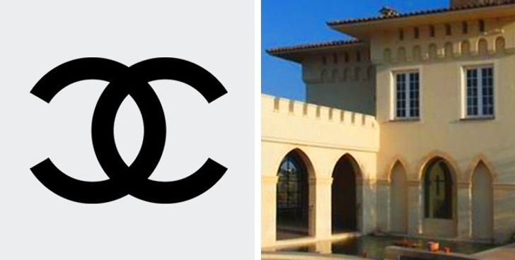
This logo’s creation story is a very special and romantic one. Coco Chanel drew it herself while staying at Château Crémat in Nice. According to one popular legend, the world-famous symbol was inspired by the castle’s vaulted arches. Many point out the magic of the letters since “CC” represents both the first letters in the name of the castle and Coco’s initials.
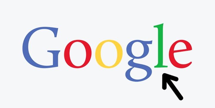
The Google logo’s creators used three main colors: red, yellow, and blue. You may notice that their arrangement within the logo is subject to a specific algorithm. But the green-colored letter breaks with the overall logic, and it is clearly meant to be the most important letter in the word. With this unexpected splash of green, the designers seem to imply that Google is about breaking stereotypes and not playing by the usual rules.
Gillette
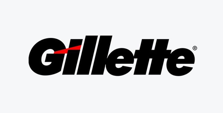
At first glance, it might seem that this logo consists of nothing more than the Gillette brand name. But, if you look closely, you can see that the edges of the letters G and I mimic the shape of the famous shaving machine’s blades.
Mitsubishi
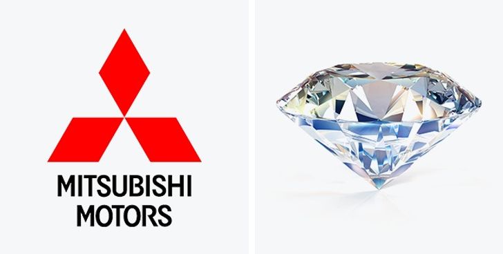
The basis of this logo consists of the coat of arms of the Iwasaki family, the founders of the Mitsubishi company. The coat of arms features three diamonds stacked on top of one another. The diamonds represent reliability, integrity, and success, while the color red implies confidence. Besides, the Japanese believe that this color helps to attract customers.
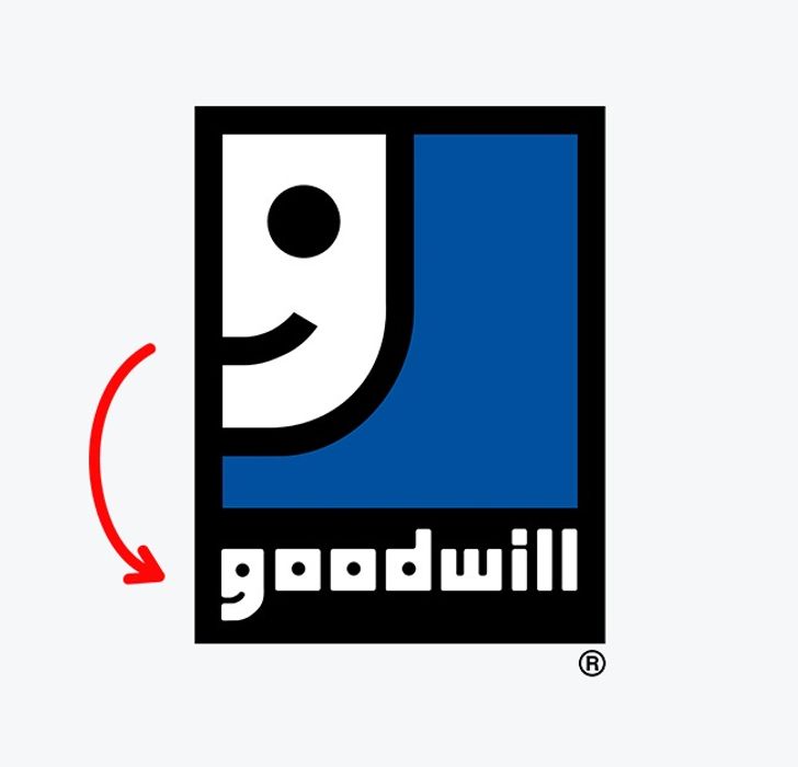
Goodwill
Goodwill is a world-renowned non-profit organization that collects donations of food, clothing, and essentials to help the needy. Employees of the organization believe that doing good deeds shouldn’t be regarded as something out of the ordinary but rather as an everyday activity. That’s why their logo is built around the letter G, which, from a distance, resembles a happy face.
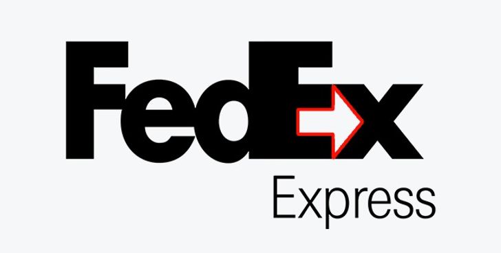
FedEx
Most people don’t immediately see the arrow formed by the empty space between the letters E and X. But, once someone notices it, he or she begins to see it first and foremost whenever looking at the logo! And that’s exactly what the designers were aiming for: the arrow acts on the customers’ subconscious, symbolizing the courier service’s speed and trustworthiness.
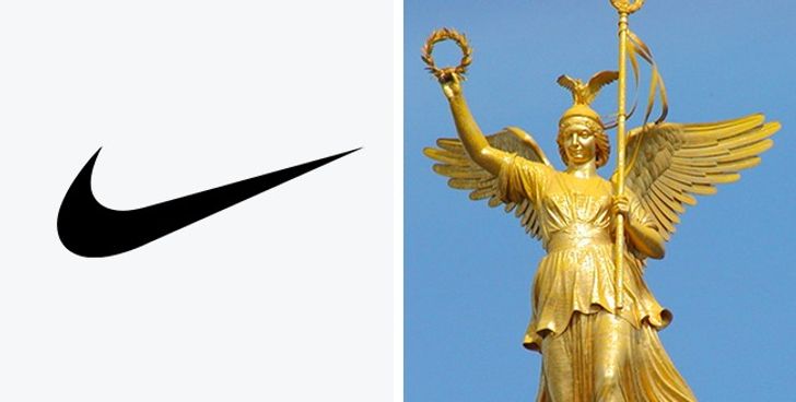
Nike
A student named Carolyn Davidson was paid a mere $35 for designing this logo in 1975. As you can easily guess, the world-famous symbol represents the wings of the Greek goddess Nike who used to inspire warriors to victory.
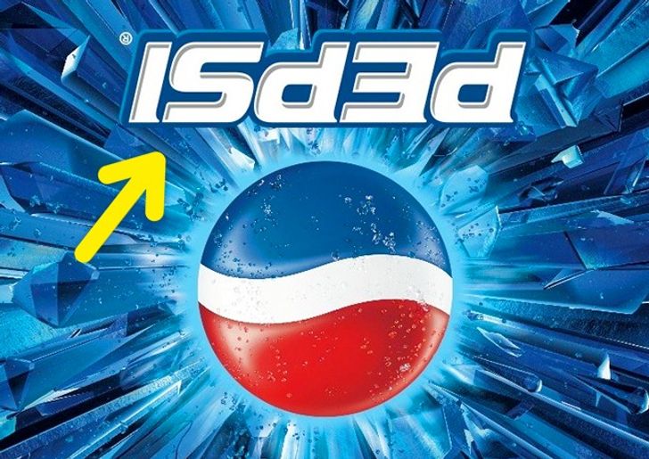
Pepsi
In the run-up to the Mexican All Saints Day (aka the Day of the Dead), Pepsi once released bottles with an inverted logo. Most customers thought that it was a simple production defect, but some of the particularly savvy shoppers realized that, when inverted, the Pepsi logo read “isded,” which was very similar to the words “is dead”!
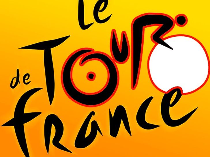
Le Tour de France
Even if you’ve seen the logo of the famous Tour de France cycling race a million times before, chances are you haven’t once noticed an image of a cyclist hidden among the letters. Look more closely – the letter R forms the cyclist’s body, and the sun becomes the bike’s wheel!
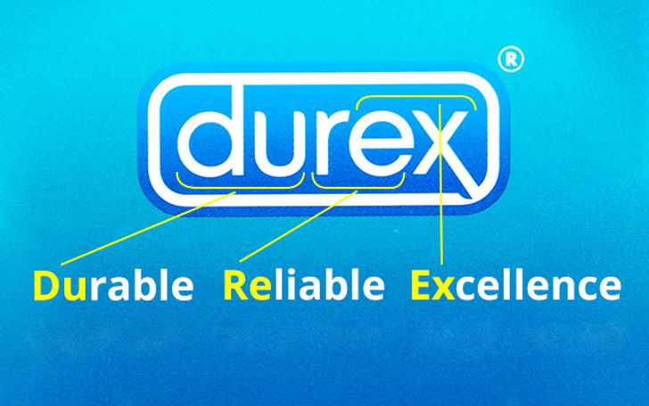
Durex
Durex is an abbreviation for “durable”, “reliable” and “excellence” – basically, everything you would want from it, right?
